

Sunday, December 28, 2014
Katana
Thursday, December 25, 2014
A lil xtra...
In my last post, I showed some storyboards I did. Here's is shot #7 from the storyboards after I blew it up and slapped some quick colors on it. Enjoy.

Heidinger © 2014 by Kaland Mebane and Enigma Resolve, LLC. All rights
reserved. No portion of this publication may be reproduced, in any form
or by any means, without the express written permission of the copyright
holders. Enigma Resolve and the Enigma Resolve logo are trademarks of
Enigma Resolve, LLC. All rights reserved.
Merry Christmas! Introducing... The Heidinger!
Merry Christmas! Today I want to debut the new IP I've been working on!
This project was created in 2010, in a story-boarding class in college. Little did I know that I would continue to push forward on it and mold it. The assignment was to create a good guy and a bad guy, write a script and direct a fight scene between the two in 50 frames.
This was the birth of HEIDINGER.
The original story was about my character, Jenda, a dragon knight cursed with “The Mark,” who was orphaned as a child when her village was mysteriously annihilated. As she returns to her place of birth to find it assaulted once more, she uncovers a dark legend about the mark that ties into her village’s slaughter. Now she must choose between her knightly duties and her personal vengeance to find the ones responsible for the death of her people so long ago. Aided by her dragon and a handful of allies, she will brave the perilous world of Arius and the unknown forces within, by hunting down the legend known only as… the Heidinger.
This project has expanded into a full comic book series and Wayne Thomason will be joining me to help write the book. Below are my original story-boards and character designs:


So without further ado, here's the finished cover to the introductory Prologue issue of HEIDINGER, due out by March (Hopefully!) :

Heidinger © 2014 by Kaland Mebane and Enigma Resolve, LLC. All rights reserved. No portion of this publication may be reproduced, in any form or by any means, without the express written permission of the copyright holders. Enigma Resolve and the Enigma Resolve logo are trademarks of Enigma Resolve, LLC. All rights reserved.
This project was created in 2010, in a story-boarding class in college. Little did I know that I would continue to push forward on it and mold it. The assignment was to create a good guy and a bad guy, write a script and direct a fight scene between the two in 50 frames.
This was the birth of HEIDINGER.
The original story was about my character, Jenda, a dragon knight cursed with “The Mark,” who was orphaned as a child when her village was mysteriously annihilated. As she returns to her place of birth to find it assaulted once more, she uncovers a dark legend about the mark that ties into her village’s slaughter. Now she must choose between her knightly duties and her personal vengeance to find the ones responsible for the death of her people so long ago. Aided by her dragon and a handful of allies, she will brave the perilous world of Arius and the unknown forces within, by hunting down the legend known only as… the Heidinger.
This project has expanded into a full comic book series and Wayne Thomason will be joining me to help write the book. Below are my original story-boards and character designs:
So without further ado, here's the finished cover to the introductory Prologue issue of HEIDINGER, due out by March (Hopefully!) :
Heidinger © 2014 by Kaland Mebane and Enigma Resolve, LLC. All rights reserved. No portion of this publication may be reproduced, in any form or by any means, without the express written permission of the copyright holders. Enigma Resolve and the Enigma Resolve logo are trademarks of Enigma Resolve, LLC. All rights reserved.
Sunday, December 21, 2014
More album designs...
...this time redesigning and/or improving the covers for New Orleans saxophonist, Brian "Breeze" Cayolle.


All cover photography and illustrations © their respective owners.
All cover photography and illustrations © their respective owners.
It ALL starts with a sketch...
Here's a look at a movie poster that I did for a production company called Eyes Entertainment, Inc. The movie, A Family on Edge, needed the image to have a mysterious feel, as it was a thriller/drama. Using some of the ideas I was given, I came up with the sketch below:

A bit crude but the idea and most importantly, the layout is there. There were a few changes that were made along the way, like the omission of the mouth and the heads were replaced with screenshots from the movie. The final image is seen below:

A bit crude but the idea and most importantly, the layout is there. There were a few changes that were made along the way, like the omission of the mouth and the heads were replaced with screenshots from the movie. The final image is seen below:
It all starts with a sketch! See more about A Family on Edge on IMDb [here].
Saturday, December 20, 2014
Practice!
Here's a few nude life drawings I've done. I love drawing from nude models, as this keeps my drawing chops up. You learn correct anatomy and it makes you faster. The human form is also one of the most complex things to draw, mainly because of its individuality.


Thursday, December 18, 2014
KILL IDA BELLE

I've done lots of album covers. Here is the most recent one that I can now reveal since it's been formally released. This cover is for an EP by a band named [KILL IDA BELLE] on Monkeygrinder Records. You can buy the digital copy or listen to it [HERE].
Also, there's a kool write-up on them on [here] (third one down) for those who wish to learn more about them. I wish these guys all the luck in the world!
I'm back!
Wow! Two months have gone by without a post! I'm slipping! Of course, I have my reasons- really KOOL reasons. ;)
Right now, I'm working on and will be releasing my own IP! It's a sci-fi/fantasy comic called Heidinger. The art will be by 'yours truly' and will be written by Wayne Thomason. (More on this later...)
Last month, my first merchandising deal was completed for Heidinger, which I'm VERY excited about. The comics and merchandise will be sold here in the future.
From here, I will be actively staying more current with updates. Along with regularly posting more art, I'm working on a better, more proper art gallery as well as a functional store here.
I have TONS of musical and artistic projects that I'll unveil soon but for now it's under wraps. Just know that this place will be growing!
Saturday, October 4, 2014
New Update...
I just added a new Gallery page. I'm still debating on the format and pictures of mine that I will post in the Gallery, so for now, it will simply link to an outside page. It's an old DeviantArt portfolio showcasing some of my past work.
My true Gallery is coming soon.
My true Gallery is coming soon.
Friday, October 3, 2014
Art Influence: Jim Lee!
As promised, with every 10th post, I'll do a write up on an artistic influence of mine. Today's spotlight is on Jim Lee.

Jim Lee really needs no introduction. He's one of the most popular comic book artists who ever lived and has the distinction of drawing the best-selling comic of all time, X-Men No.1.
Jim got his start at Marvel Comics in the 80's drawing Alpha Flight before moving on to Punisher War Journal, Uncanny X-men and the record breaking X-Men. In the early 90's, he quit Marvel to co-create Image Comics, drawing his own creation, WildC.A.T.S, which became a cartoon series, toyline and video game. Today, he works for DC Comics, having drawn Batman, Superman and now the Justice League.

Jim Lee's style is known mainly for his highly detailed line art and his cross-hatching style called feathering. Feathering are thick to thin pencil or ink strokes used to fade from light to dark, like a gradient. This style is very metallic looking and became so popular in the 90's that he was the most copied artist of the time. He's also known for his beautiful female and powerful male anatomy. His popularity also invited the criticism of his art being TOO flashy and distracting from the story.
Early Jim Lee art in Alpha Flight looks very different and simplistic from his most popular and confident work in X-Men. I feel that the biggest turning point in his work was while working with Carl Potts on Punisher. Carl single-handedly molded Jim's style by doing all of the layouts himself, allowing Jim to learn more about visual storytelling and letting him branch out more with experimenting on light and shadow. This is where his feathering and shadow technique really starts to grow to what we are most accustomed to seeing in his work today, like in Batman.
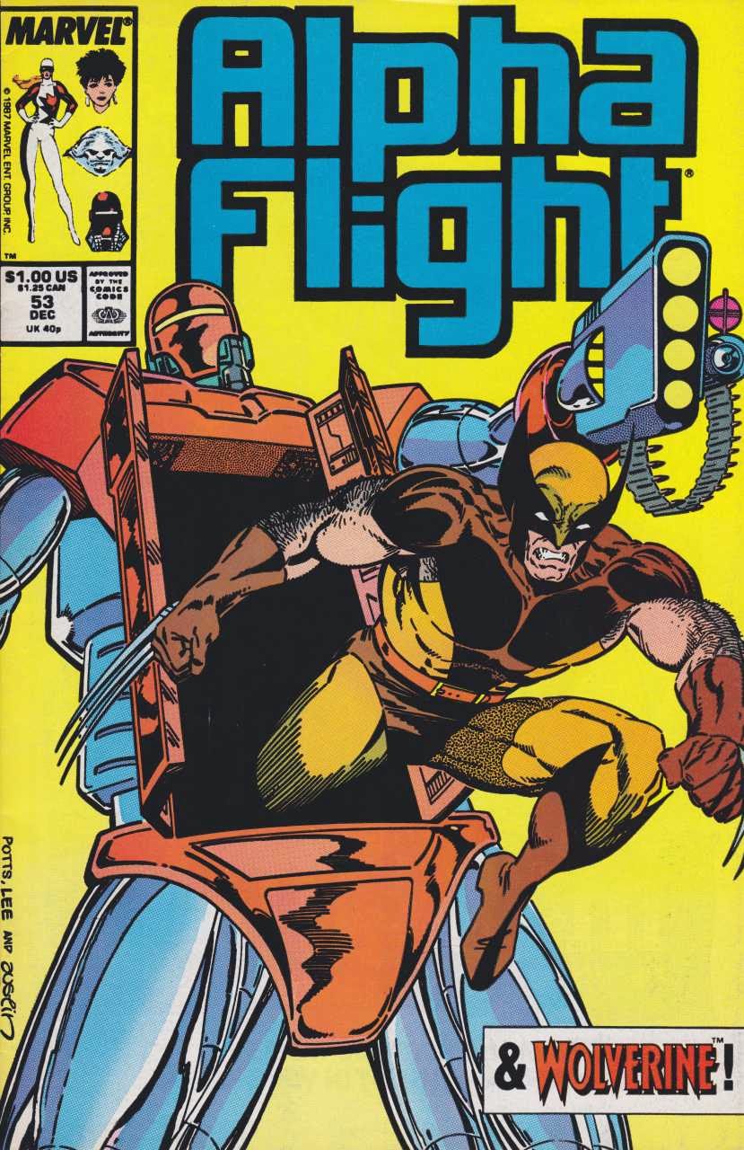


Overall, I learned the most from Jim while he worked on his own characters, WildCATS. This was my fave period of his and I feel that this was where he was at his best. Since they were his own creations, you can see the care in his art. My biggest wish is that I hope he one day returns to them.


Jim Lee really needs no introduction. He's one of the most popular comic book artists who ever lived and has the distinction of drawing the best-selling comic of all time, X-Men No.1.
Jim got his start at Marvel Comics in the 80's drawing Alpha Flight before moving on to Punisher War Journal, Uncanny X-men and the record breaking X-Men. In the early 90's, he quit Marvel to co-create Image Comics, drawing his own creation, WildC.A.T.S, which became a cartoon series, toyline and video game. Today, he works for DC Comics, having drawn Batman, Superman and now the Justice League.
Jim Lee's style is known mainly for his highly detailed line art and his cross-hatching style called feathering. Feathering are thick to thin pencil or ink strokes used to fade from light to dark, like a gradient. This style is very metallic looking and became so popular in the 90's that he was the most copied artist of the time. He's also known for his beautiful female and powerful male anatomy. His popularity also invited the criticism of his art being TOO flashy and distracting from the story.
Early Jim Lee art in Alpha Flight looks very different and simplistic from his most popular and confident work in X-Men. I feel that the biggest turning point in his work was while working with Carl Potts on Punisher. Carl single-handedly molded Jim's style by doing all of the layouts himself, allowing Jim to learn more about visual storytelling and letting him branch out more with experimenting on light and shadow. This is where his feathering and shadow technique really starts to grow to what we are most accustomed to seeing in his work today, like in Batman.
Overall, I learned the most from Jim while he worked on his own characters, WildCATS. This was my fave period of his and I feel that this was where he was at his best. Since they were his own creations, you can see the care in his art. My biggest wish is that I hope he one day returns to them.
All art used for review purposes only and copyright © & TM their respective owners.
2nd Walk-thru Process
Here is just another look at a second process I have for creating comic style art:
 1. First, I sketched the character in pen. I used a Precise V5 extra fine
roller ball pen. I always do this first step in pen because the lines
are very fine and when I use this “doodle” style in pencil, it muddies
the paper. I drew this on regular 8 ½ x 11 printer paper, since my
scanner cannot accommodate paper larger than this.
1. First, I sketched the character in pen. I used a Precise V5 extra fine
roller ball pen. I always do this first step in pen because the lines
are very fine and when I use this “doodle” style in pencil, it muddies
the paper. I drew this on regular 8 ½ x 11 printer paper, since my
scanner cannot accommodate paper larger than this.
At this point in the art, I'm only thinking about anatomy and structure for a powerful looking figure. It has to look solid and not bloopy. I focus only on contour and gesture lines and less about light-sourcing.
2. Now, I slap the sketch onto my light box. I throw a sheet of tracing paper on top and finalize my lines in pencil. My pencil of choice is a mechanical Zebra M-402; size 0.5mm HB lead.
My focus has now shifted to thinking about light sources. I prefer not to shade, as this muddies the drawing, so I draw the terminators of the shadows and how I want the light to hit the muscles. Terminators are the dividing edges of shadows that separate the dark areas from light areas. This is the most time consuming step. If I was just penciling, then this would be my last step. I would scan this as the finished pencils and give it to the inker. But I’ll ink it myself as an example for Step 3.
3. I pull out my trusty Pentel brush pen and just quickly fill in the blacks. I’m NOT an inker and this is just to give you an idea of how it will pretty much look. You can also do this step on the computer if you ink digitally.
4. Finally, I add in a bit of energy around the character's hands for good measure. I saved this for last to give the inker or colorist the chance to create the effect themselves in whichever medium they are most comfortable with.
Friday, September 26, 2014
My life as a drummer
Story time!
Once upon a time, I was recruited into a band called Isabella. The members were some of the best musicians I've ever played with. We were writing and rehearsing for our self-titled debut album when events directly related to Hurricane Katrina halted my participation. Although they completed the album with another drummer, I managed to record three songs with them that weren't released. They were 'Choppy Suite,' 'Unicorns' and 'All the Flies.'
As far as the song goes, 'All the Flies' was very tricky, being odd metered with a 9/8 signature. Other parts were in 6/8 so I focused on sub-divisions of three and triplet feels. I wanted an "up and down" feel to the song. It's very easy to get carried away in more technical pieces, so the key was trying to stay as musical as possible and just play for the song with no ego.
My playing, at that time, was some of the best I'd ever done, so I always lamented not being a part of the final product, but such is life. I've played with a lot of bands, some of which actually WENT somewhere, but for me this band was the most like that proverbial girl that got away.
Updates!
It feels really good that this blog is growing. Today, I finally got my 'Links' page up and have info there on some really cool sites for people to check out. Some are really talented artists and friends of mine and some are sites that are the perfect place to get a good deal on art or music supplies. It's by no means finished and will be updated regularly, so check back.
I also got my 'Contact' and 'About' pages up for a bit more background info on me, what I do, and how I can be reached. It's worth checking out if you have those kinds of questions.
So yea, this thing is growing! I'll FINALLY be throwing up more art (that moment you've all been waiting for!) in the new 'Gallery' page, coming soon. Look for it!
Monday, September 22, 2014
It's not ALL about me...
Today, I think I'll make a pledge to make every 10th post about one of my artistic influences. That way I can show samples of their work and talk about how important our influences are to our artistic and even personal development. That be all.
Thursday, September 18, 2014
Colors from last post

Character designs Copyright © Enigma Resolve, LLC. All Rights Reserved.
Workflow Walk-thru

Let’s look at my workflow. This changes a bit depending on my materials and style, client needs, etc. but for most of my line art, this will be my preferred workflow 90% of the time. Everyone does things differently so this ISN'T how you have to work but this offers new options. I work with a light-box and I got this technique from an artist by the name of Bart Sears and used it while studying animation in college.
Here, we are looking at a character that I designed to be used for a video game.
The main reason I work this way, is that I'm also a colorist and need my lines to be very precise and open. I don't use a lot of thick, black shading to allow the contrast and lighting to be determined in the coloring stage. Let's check out the steps:
1. First, I start off with a doodle in my 4x6 Aquabee sketchbook, using my Pilot Precise V5 pen. The lines are unfinished, to focus on the pose. The idea is to be quick and such a small drawing in a small book adds to that. From here, I scan it and blow it up in Photoshop to print on regular 8.5x11 paper. Once printed, I trace the sketch on my light-box in step 2.
2. This breakdown step is usually done in pen- my Pilot Precise V5, but since the character's design was still unclear to me at this point, I used my Zebra M-402 pencil. I was still unsure about how I wanted him to look, so I would erase bits and start again, experimenting with different designs until I stumbled upon something I liked. Again, had I known the character's design beforehand, this step would have been done in pen.
3. Once I found a design I liked for the character, I slapped it on the light-box again with a new sheet of paper on top and ink my final lines. I would correct a few more mistakes and add more details. For this step, I use my Pigma Micron pens.
The PROS and CONS of this method?
PROS: It allows you to iron out the kinks as you go along. You can do damage and quality control and not rush the art. You can go back to a previous step, unlike doing it all in one go.
CONS: The back and forth extra steps can be time consuming. You also go through A LOT of paper!
Character designs Copyright © Enigma Resolve, LLC. All Rights Reserved.
Tuesday, September 16, 2014
My Tools, Pt. 2

Looking at the picture above, we start at the upper right,
which is my sketchbook. To its lower left, is my Wacom tablet and under them
all is my light-box. I’ll go through each one:
1. 4x6 Aquabee Super Deluxe Sketch Book – Yes, 4x6! I know it’s
small but that is the point. The point is to SKETCH and sketching smaller
decreases time. Sometimes I need to get an idea out very quickly before I lose
it. Since it’s pocket sized, it can go a lot more places with you too. With
today’s scanners, I can always just scan later and blow it up larger for final
details.
2. Wireless Wacom Intuos4 Medium Pen Tablet – When I use
Photoshop, I use my Intuos to do my coloring. The wireless version has a
removable USB cord to connect with the computer through Bluetooth. In addition,
I color with the mouse.
3. ArtGraph LightTracer II Light-box – When I scan and blow up
my sketches, I print them out, slap a fresh sheet of paper over the blown up
sketch on my light-box and I trace. Yes, I TRACE. This technique was learned as
I studied animation in art school. You don’t mess up your art or paper by constantly
erasing and redrawing. Just trace your corrections on top and you have clean final
art. This is also why I only draw in pen, as it is easier to see through the
paper than pencil.
In my next post, I’ll walk through a piece of art that I
completed, explaining in better detail how I used these tools.
My Tools, Pt. 1
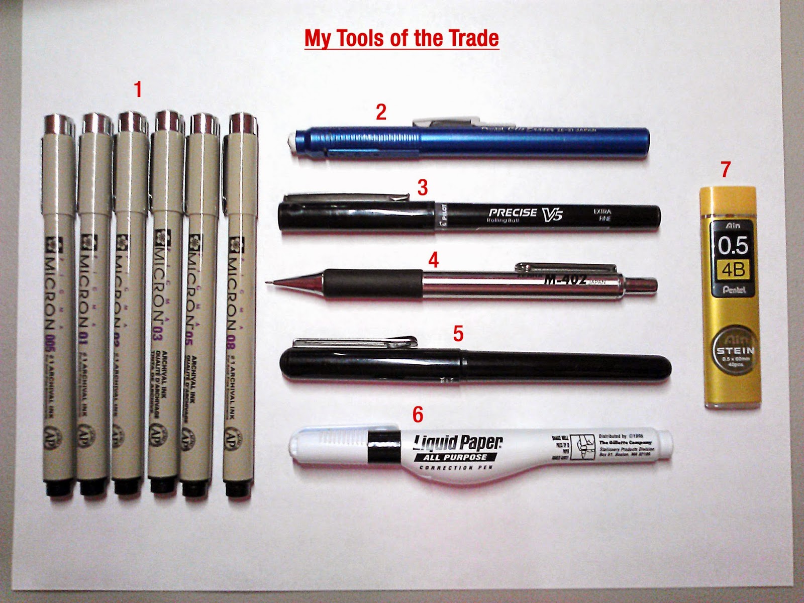
Considering I’ll be posting my art, I think this is a good
time to look at what I use to make the art and describe my work process. Every
artist is different and the tools we use can differ depending on our style and
technique.
These days, my style focuses on clean, contour line art and
digital coloring in Photoshop, so my tools, or LACK of tools, reflect this. This
is what works best for me and I’m not saying that anyone should to go out and
buy only what I use.
Shown in the picture, listed in no real order, are my
weapons of choice:
1. Pigma Micron Set – Blah. Inking. I HATE it. My hand isn’t
steady enough for it; too much drumming I suppose. When I do have to ink, I
pull these puppies out. They are waterproof, have great line quality and come
in lots of sizes.
2. Pentel Clic Eraser – I switched to this bad boy when I was
in 7th grade. I was tired of using up my erasers on pencils and then
you get all the way to the ferrule and it rips your paper. Also,
I bet you didn’t know it was called a ferrule! I hardly use this thing anymore,
because… well, see below.
3. Pilot Precise V5 Rolling Ball (extra fine) – Here is the
‘meat and potatoes’ of my tool set. Oddly, I NEVER draw in pencil anymore, so
this is my No.1 drawing tool. Pencil just doesn’t give me the contrast that I
like and I literally don’t feel comfortable with anything else. The line is
thin and clean. It has very dark, almost watery ink and a fast response, so it
requires good control. It gives me the contrast I need for scanning and
light-boxing*. If this pen were a chick, I’d be on my honeymoon. Forever. Like,
literally. You’d never see me again. Never. Ever.
4. Zebra M-402 Mechanical Pencil– Pencil connoisseurs know that
the 402 is one of the greatest mech pencils ever made. The 402 is super durable
with a stainless steel body and rubber grip that’s comfortable and isn’t too
grippy. People are big on making custom mods to this pencil and I myself
modified the end cap to seal off the eraser, since I’d use my Pentel Clic. I
use this when I absolutely HAVE to draw in pencil.
5. Pentel Brush Pen – This pen is a bit of a legend. It has
REAL bristles, not that lame felt-tip that is shaped into a point. Therefore,
you get the real separation of a brush but it is refillable like a pen. Str8 genius.
6. Liquid Paper Correction Pen – This thing is not only used
for correction, but it has a thin metal point so it can be used to draw thin
white lines over black areas. Positive over negative.
7. Pentel Ain Stein 0.5 4B Lead – If you’re an artist you’re probably
thinking, “4B??? You’re fuckin insane!” Well, let me explain! I know most
artists work in HB to 2B but I do a lot of scan work and light- boxing* so I
need a darker lead. Yes, 4B is soft and smudges more but the payoff is that
it’s easier to see, erase and it scans better.
As you can see, a lot of this can take YEARS to figure out
what does and doesn’t work for you. Just think of the hundreds of things that
I’ve used and discarded that DIDN’T end up on this list. I hope this is helpful
for those starting out or even veteran artists looking for change. The only
other things that I use exclusively for my art production, like Photoshop and
my light-box*, I’ll discuss in a follow up post explaining my actual workflow.
*more on my light-box technique in the next post!
Subscribe to:
Posts (Atom)